
TL;DR

Get coffee and tea gear delivered free with Prime
- Fast, free delivery on millions of items
- Prime Video, Amazon Music and more included
- Member-only deals all year
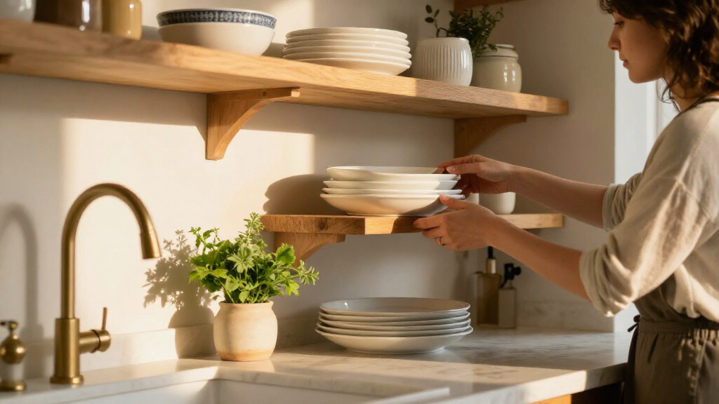
Ina Garten’s decorating advice, reported by Good Housekeeping, is to choose a small color palette for kitchen items on display, such as white china and silver. She also recommends mixing shapes, heights and old and new pieces rather than matching everything.
Ina Garten recommends choosing a small color palette for kitchen items on display, with white china and silver as one example, according to a Good Housekeeping report on her decorating advice. The suggestion offers homeowners a way to make visible dishes and serveware feel more coordinated without replacing cabinets or buying a matching set.
Garten shared the palette advice in a post on her Substack, writing: “Choose a small color palette and stick to it, such as white china and silver.” Good Housekeeping describes the approach as adaptable: the idea is to select a few colors that work with pieces already in the kitchen, rather than treating white and silver as the only suitable combination.
The report also points to Garten’s preference for displaying dishes and trays that are both useful and meaningful to their owner. Open shelves or glass-front cabinets can make those objects visible, while a limited palette can help varied pieces read as a considered collection. This is a styling suggestion, not a claim that a particular palette will suit every kitchen or homeowner.
Garten advises mixing old and new items, as well as varying their shapes and heights. Good Housekeeping quotes her recommendation to place “different shapes—round, flat, plus different heights” together, rather than arranging a shelf of only bowls or only plates. The report also says she suggests adding height by leaning a platter against a wall or including cookbooks or a wireless table lamp.
A Palette That Works With Existing Dishes
The advice matters to readers because it focuses on a change that can be made with items already on hand. Kitchenware is often bought over time, and replacing a full collection to follow a decorating trend can be costly. Choosing a few compatible colors offers another option: arrange the pieces people own in a way that makes the display feel more unified.
Garten’s approach also allows for personal choice. White and silver are her example, but the broader principle is to limit the colors in a display and use variety in shape, material and height to keep it from looking overly uniform. That distinction is useful for anyone who wants a coordinated appearance without making every plate, bowl or serving piece identical.
The recommendation is still a matter of taste. Good Housekeeping presents the palette as a way to create a timeless look, but the report does not offer testing or evidence that one color combination is objectively more durable or attractive than another. The practical takeaway is narrower: a restrained palette can make a collection of visible kitchen items look more cohesive.
As an affiliate, we earn on qualifying purchases.
How Garten Builds a Kitchen Display
The Good Housekeeping report draws on Garten’s Substack advice and her broader approach to displaying kitchen objects. It says her social media photographs have featured a mix of cream-colored cookware, muted bowls and silver serving pieces. Those examples illustrate the white-and-silver idea, though the article’s central recommendation is to choose a palette that suits the pieces and space a reader already has.
Garten’s additional guidance focuses on arrangement rather than purchasing. She favors combining different shapes and heights, and placing useful, loved dishes and trays where they can be seen. A platter propped upright, a stack of cookbooks or a lamp can add height to a shelf or counter display. The report does not specify a required number of colors, a particular budget or a single arrangement that every kitchen should follow.
silver serving tray for kitchen display
As an affiliate, we earn on qualifying purchases.
As an affiliate, we earn on qualifying purchases.
What the Styling Advice Does Not Specify
The report does not state when Garten published the Substack post, and it does not give a formal product list, exact palette size or step-by-step setup. It also does not establish that white and silver are preferable for all kitchens; they are presented as an example of a limited palette. Whether a display works will depend on the objects, available space and individual preference.
As an affiliate, we earn on qualifying purchases.
A Low-Cost Way to Try the Idea
Readers can apply the suggestion by looking at the dishes, trays and cookware already visible in their kitchen, then grouping pieces around a few compatible colors. The next step is to vary shapes and heights and, where suitable, use shelves or glass-front cabinets to show items they regularly use. Garten’s advice does not require a purchase or a renovation; any changes can be made gradually as existing pieces are rearranged or replaced.
glass front kitchen cabinet display
As an affiliate, we earn on qualifying purchases.
As an affiliate, we earn on qualifying purchases.
Key Questions
What is Ina Garten’s kitchen decorating tip?
Garten recommends choosing a small color palette for displayed kitchenware. She gives white china and silver as an example.
Do I need to buy new dishes to use the idea?
No. The Good Housekeeping report says the approach can be adapted to pieces a homeowner already owns. The suggestion is to group items in a few complementary colors, not replace a full collection.
How does Garten suggest arranging dishes?
She recommends mixing different shapes and heights, including round and flat pieces, and combining old and new items. A platter leaned against a wall or a stack of cookbooks can add height.
Does Garten say every kitchen should use white and silver?
No. White china and silver are her example of a restrained palette. The report says the idea can be adapted to another simple color combination that suits the kitchen and its existing pieces.
Source: rss
Halloween Picks
halloween
As an affiliate, we earn on qualifying purchases.